UGG FIXTURES

AOR Team: QUEZADA ARCHITECTURE

Principal: Cecilia Quezada
Project Manager: Kristen Smith.

Design Team: Florencia Pita & Co.

Principal Designer: Florencia Pita
Team: Rachael McCall (Lead Designer), Alayna Davidson, Jonathan Warner, Sofía Ospina, Srimoyee Sinha, Pin Chih Liao, Ana Antoni, Christina Griggs.

Press:
ThisxThat: Honora Shea and Danielle Rago.

Photography:
Amy Barkow
Michael Czerwonka

Consultants:

T Magen (General Contractor)
Tom Moran, Project Executive

Oculus Light Studio (Lighting Designer)
Joel Weston, Associate

Paradigm Structural Engineers (Structural Engineer)
Aaron Blum, Project Engineer

2L Engineering (MEP)
Jeremy Latterman, Principal

Teecom (Acoustics, Security)
Maria Gonzalez, Principal

Custom Rugs, supplier (Mohawk Group)
Eddie Curiel, account executive

Custom Rugs, fabricator (Sherland & Farrington)
Ross Langhorn

FELBRO
Fixture Manufacturer

Los Angeles-based architecture studio Florencia Pita & Co., in partnership with San Francisco-based Quezada Architecture, has designed the new Fifth Avenue flagship store for UGG in New York City. The Southern-California-based company is launching a global expansion, with this flagship store signifying its evolution from purveyor of their classic boot to a broad lifestyle brand. The design of the boutique is inspired by the experience of California and informed by the reinterpretation of traditional craftsmanship, with custom fixtures and furniture made through both advanced and traditional fabrication techniques in downtown Los Angeles. The UGG Flagship store is the first design collaboration between the two female-owned firms, founded by Florencia Pita and Cecilia Quezada respectively. Pita and Quezada are cousins, both born in Argentina and now living in California.
To recreate the experience and ethos of California, the architects looked to architecture, art, film and literature.The Eames’ mid-century case study house, in which a steel structure and modular “kit of parts” were employed to create an open and flexible space that existed in harmony with nature, inspired the layout of the brand’s new headquarters. The quality of light and landscape in California inspired both a glowing LED wall and the store’s soft, curving contours. Like the work of Ed Ruscha and David Hockney, the architects sought to achieve more than just a snapshot of California, rather, a more layered image of California and its ideals, guided by openness and flexibility.
“The flagship is driven by the concept of ‘lifestyle’, which is not only about the products or merchandise, but rather about an ideal of a more free and open space for an open society. The space is fluid, there are no designated men’s or women's areas, they can all be either/or, and the layout can be constantly changed and re-adapted. The custom-made freestanding fixtures, which allow for a more intimate shopping experience, are designed to be movable and flexible, and embrace multiple ‘lifestyles’ and narratives,” says Florencia Pita, principal of Florencia Pita & Co.
The store is arranged across the first two levels of a 26-story tower located on the corner of Fifth Avenue and 45th Street. The street level’s high ceiling and enveloping windows bring in the cityscape, while a large steel-framed structure acts as a modular construct for display, circulation, and the framing of views. This structure can be merchandised in three modules: the front module towards the entry serving as an exhibition display and ‘lifestyle’ feature, the center module as a seasonal display, and the third module as a shoppable display. The ‘store window’ is a delineated bench that begins at the front of the store on Fifth Avenue and continues to the south window at 45th Street. This bench plays a double role as both a seating area and display surface, engaging with the view of the sidewalk.
At the north wall, the structure is backed by a large graphic wall that leads to the back of the store, curving as it welcomes customers to take the escalator to the second level. The graphic surface features LED lights; on the ground level, its graphic will change every season, but as one takes the escalator, the experience changes to one of immersive light, with the translucent programmable LED lighting coming from the wall and ceiling surfaces. The escalator, as a transitional space similar to the open roof courtyard typical of a mid-century house, suggests a soft, glowing, California-inspired sunset . At the second floor, there is a shift towards more intimate and domestic experience: displays and private seating areas are arranged to emulate living rooms and cozy parlors, with details that exude warmth, including soft lighting and textured surfaces.
Two hallmarks of the UGG brand were abstracted to form design motifs throughout the store, and brought to life using craft techniques. The UGG logo pattern was abstracted to a geometric profile and repeated, forming a pattern that was laser-cut into the metal surfaces of furniture, fixtures, and parts of the facade. The geometry of the classic UGG boot undersole also figures into the surfaces throughout. As inspiration, the architects looked at the embossed “sun flake” geometry and the undulating curve of the sole when viewed from the side. The curve was extruded to create a custom-milled panel material with vertical grooves and light and shadow effects, giving texture and character to the walls and surfaces of displays and tables throughout.
Custom-made terrazzo in a soft white hue with gold and grey-silver flecks also figures prominently in the design, but through a reinvented approach. While the material is typically used for flooring, here it is molded to wrap fixtures and furniture such as benches, tables, and risers. Instead of appearing as a flat surface, the material becomes volumetric, with plasticity and softness. Its composition of aggregate stone and bonding polymer provides a textured effect.
The store’s warmth, flexibility, and future-forward attention to craft summon the brand’s newly expansive direction. “An imagined California is one that transcends reality to characterize both the emotion and warmth of the California lifestyle that captivates the world. From nature to home and back again, this journey captures the aura of the UGG brand by highlighting the specific qualities of the California landscape that defines it - light, texture, air.”, says Cecilia Quezada, principal of Quezada Architecture.

 UGG DILLARDS

AOR Team: QUEZADA ARCHITECTURE

Principal: Cecilia Quezada
Project Manager: Kristen Smith.

Design Team: Florencia Pita & Co.

Principal Designer: Florencia Pita
Team: Rachael McCall (Lead Designer), Alayna Davidson, Jonathan Warner, Sofía Ospina, Srimoyee Sinha, Pin Chih Liao, Ana Antoni, Christina Griggs.

Press:
ThisxThat: Honora Shea and Danielle Rago.

Photography:
Amy Barkow
Michael Czerwonka

Consultants:

T Magen (General Contractor)
Tom Moran, Project Executive

Oculus Light Studio (Lighting Designer)
Joel Weston, Associate

Paradigm Structural Engineers (Structural Engineer)
Aaron Blum, Project Engineer

2L Engineering (MEP)
Jeremy Latterman, Principal

Teecom (Acoustics, Security)
Maria Gonzalez, Principal

Custom Rugs, supplier (Mohawk Group)
Eddie Curiel, account executive

Custom Rugs, fabricator (Sherland & Farrington)
Ross Langhorn

FELBRO
Fixture Manufacturer

Los Angeles-based architecture studio Florencia Pita & Co., in partnership with San Francisco-based Quezada Architecture, has designed the new Fifth Avenue flagship store for UGG in New York City. The Southern-California-based company is launching a global expansion, with this flagship store signifying its evolution from purveyor of their classic boot to a broad lifestyle brand. The design of the boutique is inspired by the experience of California and informed by the reinterpretation of traditional craftsmanship, with custom fixtures and furniture made through both advanced and traditional fabrication techniques in downtown Los Angeles. The UGG Flagship store is the first design collaboration between the two female-owned firms, founded by Florencia Pita and Cecilia Quezada respectively. Pita and Quezada are cousins, both born in Argentina and now living in California.
To recreate the experience and ethos of California, the architects looked to architecture, art, film and literature.The Eames’ mid-century case study house, in which a steel structure and modular “kit of parts” were employed to create an open and flexible space that existed in harmony with nature, inspired the layout of the brand’s new headquarters. The quality of light and landscape in California inspired both a glowing LED wall and the store’s soft, curving contours. Like the work of Ed Ruscha and David Hockney, the architects sought to achieve more than just a snapshot of California, rather, a more layered image of California and its ideals, guided by openness and flexibility.
“The flagship is driven by the concept of ‘lifestyle’, which is not only about the products or merchandise, but rather about an ideal of a more free and open space for an open society. The space is fluid, there are no designated men’s or women's areas, they can all be either/or, and the layout can be constantly changed and re-adapted. The custom-made freestanding fixtures, which allow for a more intimate shopping experience, are designed to be movable and flexible, and embrace multiple ‘lifestyles’ and narratives,” says Florencia Pita, principal of Florencia Pita & Co.
The store is arranged across the first two levels of a 26-story tower located on the corner of Fifth Avenue and 45th Street. The street level’s high ceiling and enveloping windows bring in the cityscape, while a large steel-framed structure acts as a modular construct for display, circulation, and the framing of views. This structure can be merchandised in three modules: the front module towards the entry serving as an exhibition display and ‘lifestyle’ feature, the center module as a seasonal display, and the third module as a shoppable display. The ‘store window’ is a delineated bench that begins at the front of the store on Fifth Avenue and continues to the south window at 45th Street. This bench plays a double role as both a seating area and display surface, engaging with the view of the sidewalk.
At the north wall, the structure is backed by a large graphic wall that leads to the back of the store, curving as it welcomes customers to take the escalator to the second level. The graphic surface features LED lights; on the ground level, its graphic will change every season, but as one takes the escalator, the experience changes to one of immersive light, with the translucent programmable LED lighting coming from the wall and ceiling surfaces. The escalator, as a transitional space similar to the open roof courtyard typical of a mid-century house, suggests a soft, glowing, California-inspired sunset . At the second floor, there is a shift towards more intimate and domestic experience: displays and private seating areas are arranged to emulate living rooms and cozy parlors, with details that exude warmth, including soft lighting and textured surfaces.
Two hallmarks of the UGG brand were abstracted to form design motifs throughout the store, and brought to life using craft techniques. The UGG logo pattern was abstracted to a geometric profile and repeated, forming a pattern that was laser-cut into the metal surfaces of furniture, fixtures, and parts of the facade. The geometry of the classic UGG boot undersole also figures into the surfaces throughout. As inspiration, the architects looked at the embossed “sun flake” geometry and the undulating curve of the sole when viewed from the side. The curve was extruded to create a custom-milled panel material with vertical grooves and light and shadow effects, giving texture and character to the walls and surfaces of displays and tables throughout.
Custom-made terrazzo in a soft white hue with gold and grey-silver flecks also figures prominently in the design, but through a reinvented approach. While the material is typically used for flooring, here it is molded to wrap fixtures and furniture such as benches, tables, and risers. Instead of appearing as a flat surface, the material becomes volumetric, with plasticity and softness. Its composition of aggregate stone and bonding polymer provides a textured effect.
The store’s warmth, flexibility, and future-forward attention to craft summon the brand’s newly expansive direction. “An imagined California is one that transcends reality to characterize both the emotion and warmth of the California lifestyle that captivates the world. From nature to home and back again, this journey captures the aura of the UGG brand by highlighting the specific qualities of the California landscape that defines it - light, texture, air.”, says Cecilia Quezada, principal of Quezada Architecture.

BLUE VELVET STOOL

Designers: Florencia Pita, Jacklin Hah Bloom

Project Team:  Kyle Branchesi, Smita Lukose, Shane Reiner-Roth

Los Angeles, CA. 2014

LAXArt Garden Party Auction

This project was commissioned by LAXArt (a non-profit gallery in Los Angeles) to use the Ikea Marius stool as an armature for a design to be auctioned at their annual summer fundraising event.  Our design reconfigures contours that are reminiscent of “C” and “S” shapes from baroque period furniture, to develop a set of outlines for the stool legs and seat.  Each piece is a two-dimensional flat CNC cut, which then sandwiches the given armature.  An artificial materiality is achieved through a graphic was that has the depth and texture of upholstery, then muddled with a patterned texture to allow the depth and flatness to play off each other.   This upholstery graphic is printed directly on to the surface, allowing the color to seemingly be integral to the flat mdf panel.  

ALICE

Designer: Florencia Pita

Project Team: Ai Amano, Guillermina Chiu, Zarmine Nigohossian, Clair Souki, Tanja Werner

Curator: Lauri Firstenberg

Los Angeles, CA. 2007

LAXArt Gallery Installation

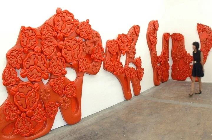
Alice is an installation that takes its form from a tale, its name comes from a narrative that creates multiple fictional landscapes. There is no literal relationship between the installation and the original story by Lewis Carroll, it is indeed an aim to capture the sensibility and atmosphere that is present in the story and therefore intends to embed the space with it. Much of the aesthetic of the piece is related to the images created by John Tenniel (1865) where the black and white engravings outline an incredible focus on the detail of overlapping patterns, which accentuate a very frontal two-dimensional graphic space with a shallow depth. Later iterations such as the illustrations by Arthur Rackham (1907) introduce color, which converts the patterns into moods.

Alice installation focuses on ideas of figuration and color. Figuration is developed as a way to exaggerate form, to capture very specific geometrical notations of given objects and manipulate them, a kind of exacerbated embellishment of curvaceous form. Color allows for the double manipulation of materiality and space, certain materials have a coded color condition that defines their character; this project intends to exacerbate materiality’s character by exalting its pigmentation. In Alice the material is plastic and the color is orange, the idea was that the right sensibility for the object should be similar to that of a plastic toy, were you see how the parts lock, and you definitely have the urge to touch it. The work resides within an aesthetic of densely ornamented form that returns to a realm of embellishment and fantasy.

CRONOPIOS

Designers: Florencia Pita

Project Team: Tristan Brasseur , Erin Lani, Pil-Sun Ham, Amanda Hamilton, Kim Lagercrantz, Dulrye Mhin, Yushan Wu

Animation: Jaitip Srisomburanont

Model Photos:  Georgina Huljich

Fabrication Team:  Drura Parrish, Rives Rash

Chicago, IL. 2010

Art Institute of Chicago Installation Exhibit

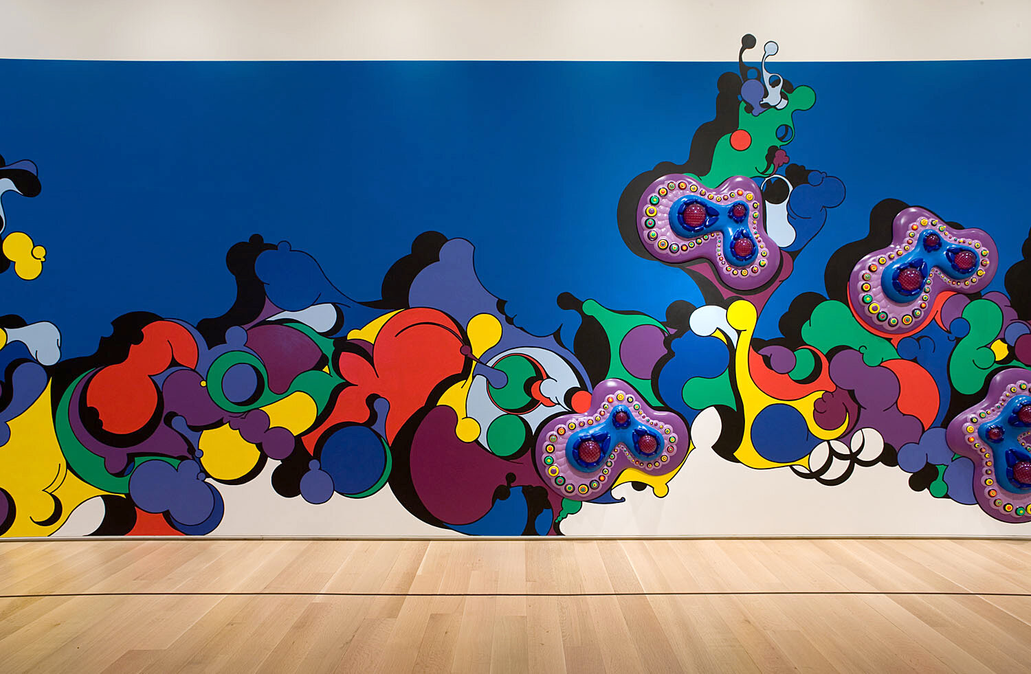
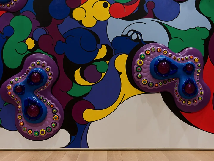
The name Cronopios originates from a character in the book 'Stories of Cronopios and Fames' (1962) by Argentine writer Julio Cortazar. The 'Cronopios' are described as unique characters; they are naïve, unconventional and sensitive creatures with lush imaginations. Cortazar depicts them in short vignette-proclamations that have an air of surrealist fairy-fragments, with stories such as: 'Instructions on how to climb a staircase' and 'Turtles and Cronopios' that chronicle exhilarating yet casual events.  This installation presents a chronicle of short vignette-drawings where the 2D graphic has an artificial depth, created by exhausting the compelling attributes of extreme coloration, abstract figuration and shallow materiality. The playful atmosphere of the drawings incites a sense of enchantment, as in fairy tales, the enchantment provokes a kind of illusion in a contriving atmosphere of fiction and fantasy. The graphicness of the drawing is excessively expended, a bias towards the drawing becoming highly picturesque, lavish of arresting beauty.

PULSE

Designers: Florencia Pita & Jackilin Hah Bloom

Project Team: Daren Chen, John Klein, Zarmine N. Nigohossian, Clair Souki

Los Angeles, CA. 2006

SCI-Arc Gallery Installation

The site-specific installation Pulse: Tendril Formations emphasizes the manipulation of color and material as a double mechanism for the production of spatial affect. The gallery is transformed into an entirely pink landscape with winding walls, or structural tendrils, made of 300 CNC lasercut sheets of thin plastic, with contoured benches coiling out of the meandering walkways. With pink floors and walls, the exhibition offers an environment and s patial effect of total immersion in color, atmosphere, and material. The structural tendrils, formulated through mathematical computation, allow the building materials to be the structure itself, without any supporting structure. The structure’s complexity, achieved through multiplicity, is created by the proliferation of layers of single curvature. The extrusion of two-dimensional materials into a three-dimensional pattern and flow accentuates ornamentation through structure and volume without infrastructure. Inspired by the late 19th century nature photographs of German artist Karl Blossfeldt and by the complex fabric structures of contemporary fashion innovator Junya Watanabe,the installation investigates notions of color and form as performative elements that embed spaces with mood and atmosphere.

UMMA TABLE

Designers: Florencia Pita

Project Team: Erin Lani, Wan Lee, Makenzie Murphy, Danyal Sadiz, Marie-Sophie Starlinger, Freesia Torres

UMMA Director: Joe Rosa

Table Fabrication: Vincent Pocsik, Brandon Vickers (Alley 36)

Jewelry Fabrication: Federico De la Serna

Ann Arbor, MI. / Los Angeles, CA. 2013

University of Michigan Museum of Art & SCI - Arc Library Gallery

Organized by the University of Michigan Museum of Art, FlorenciaPita/FP mod explores the provocations and intersections of digital technology, material experimentation, and ornament in the work of Argentina-born, Los Angeles-based architect and designer Florencia Pita. The exhibition and its related publication, part of the UMMA Books series, trace the evolution of Pita's design ideology through installation pieces, urban design, tableware, furniture, and architecture, as well as small adornments. Pita’s boldly colored works draw from literary, art, and biological sources; employ cutting-edge architectural fabrication techniques; and cross borders of visual art, architecture, and design.

JEWELRY

Designers: Florencia Pita & Jackilin Hah Bloom

Prototype studies